Worked with Fenn Valley first on a new logo that more accurately reflected their brand. Their brand identity description is farm-to-bottle, family owned, and history-rich. Their team wanted a logo that was related to the old logo that was created in 1973 — not something so drastically different it would not be recognized, but at the same time something new and fresh. Other considerations were web appearance, resizing options, and single color representation.
I started with related fonts to the original and a custom illustration, as the original logo had an illustrated component. We spent several months doing fast-paced iterations of nine to twenty-five options that were taken to the team and voted upon, and those were used as the basis of the next set. We worked for approximately three months until a final was agreed upon. The new logo has been met with a great deal of enthusiasm.
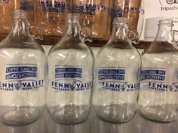
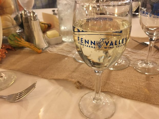
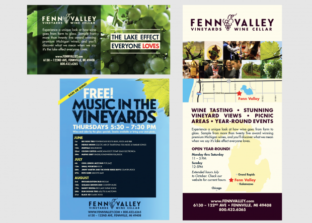
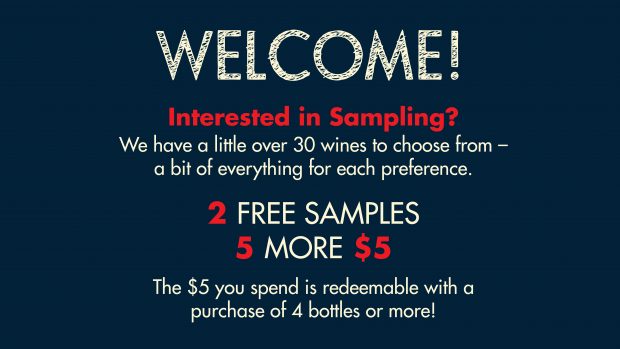
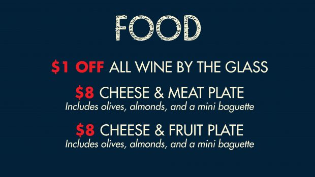
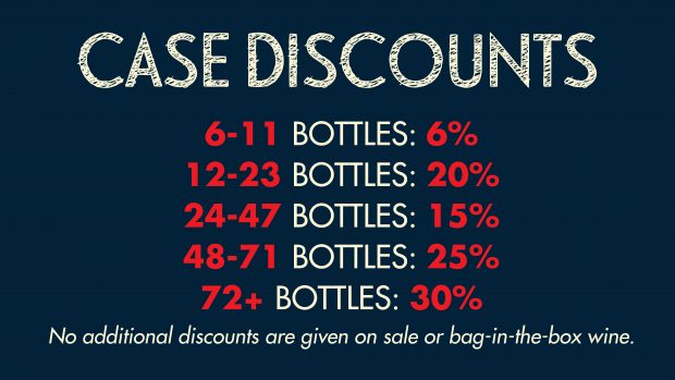
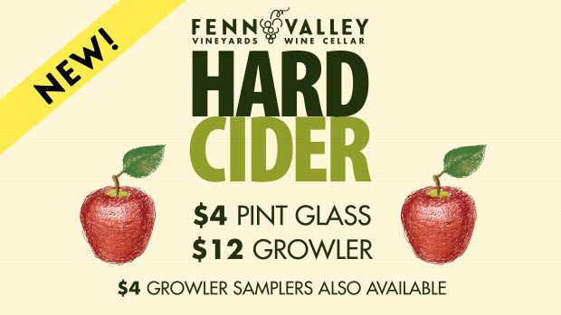
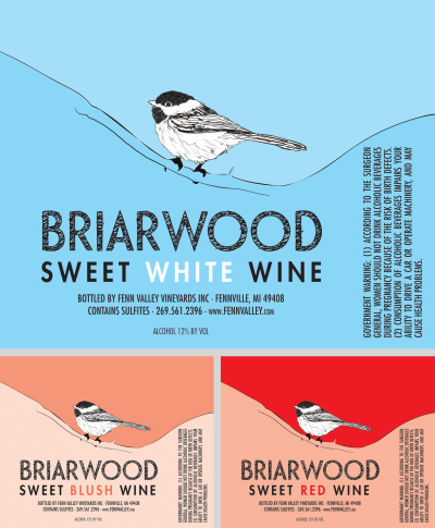
After the creation of the logo, I created a new look and feel for all marketing materials, creating new ads, rack cards, tasting room literature and digital signage, and many labels for a cohesive presentation of the Fenn Valley brand — all with team participation, feedback, and approval.

